The Swedish National Museum of Art reopens
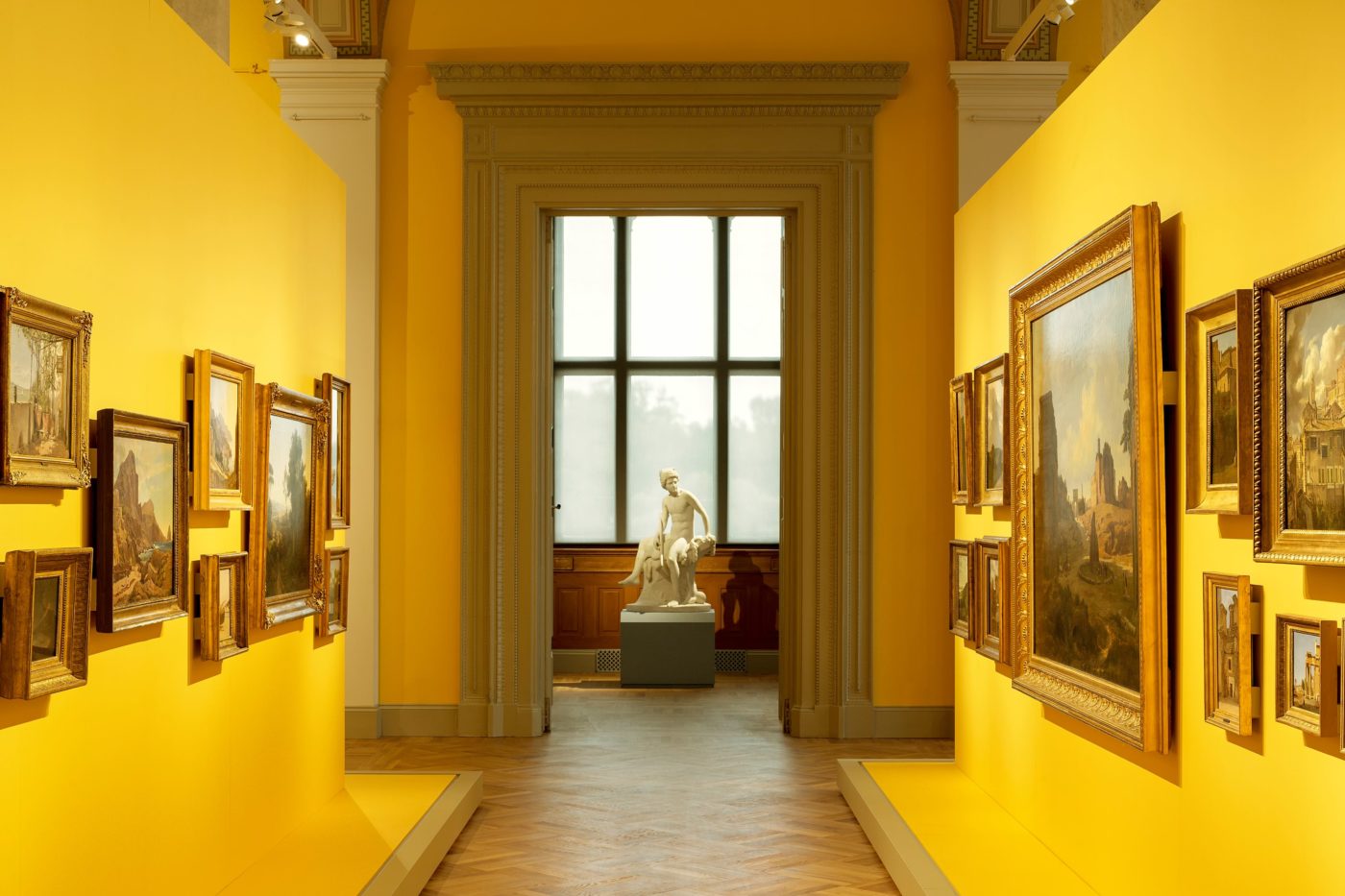
In 1768, the Swedish artist Alexander Roslin painted a portrait of his French wife Marie-Suzanne Giroust. Attired in what is described as ‘Bolognese dress’, she is depicted holding a folded fan, coquettishly peeking out from behind a black veil that covers half her face. It is a compelling and affectionate study of a woman who was not only a domestic paramour, but an accomplished artist in her own right, specialising in exquisitely detailed pastel portraiture. ‘The Lady with the Fan’ now hangs in a small corner room on the top floor of Stockholm’s Nationalmusem. The walls of this particular room are painted a warm yellow and its high, arched windows are screened with gauzy blinds to diffuse natural light. An array of objects populates the space – paintings, sculpture, furniture, ceramics and glass – reflecting the plurality of the Nationalmuseum’s historic collections.
The yellow room forms part of an enfilade of small, intimate galleries or ‘cabinet rooms’, each with boldly coloured walls and similarly atmospheric displays. The aim is to conjure a sense of immersion in particular periods, rather than simply present a chronological litany of objects. Within these wunderkammer, certain details catch the eye – the fresh green of a bundle of ceramic asparagus echoed in the verdant hue of the walls, an ornamental clock, the delicate blue tiling of a Delftware flower pyramid, antique glassware.
And of course, in her own wunderkammer the ‘Lady with the Fan’ still holds the visitor’s gaze, two and a half centuries after she was first painted.
On a press tour of the newly renovated Nationalmusuem, the responsible architect Gert Wingårdh picks out Roslin’s famous portrait as being emblematic of the spirit of the museum emerging from a six year gestation like a radiant butterfly from a dusty cocoon. To give some sense of the distance the building has travelled, Wingårdh also indicates a small section of the original wall frieze, its drab grey and brown tones instructively preserved for perusal like a fossilised specimen from a previous epoch.
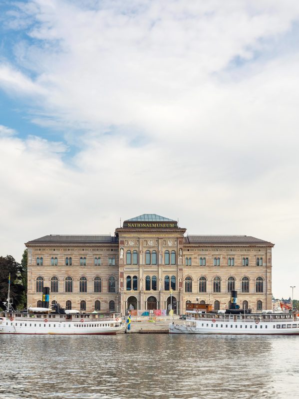
Commissioned in 1844 and opened in 1866, the Nationalmuseum shares its architect, the Prussian Friedrich August Stüler, with Berlin’s Neues Museum, completed seven years earlier. It also shares a similar footprint of two courtyard blocks bisected by an imposing ceremonial staircase. In common with many 19th century European institutions, the Nationalmuseum steamed serenely through the decades, like a great ship of state, promoting the familiar narrative of custodian of the nation’s treasures. But the challenges of the current era are more complex and self-questioning. How can such a museological behemoth be refreshed and reframed to appeal to a wider constituency, while tactfully maximising opportunities for revenue generation? How can such a large, labyrinthine building be made a more efficient and delightful armature for the display and public understanding of cultural heritage?
For Wingårdh, it has been a deeply personal project. ‘My first memory of the museum is running up and down the main staircase as a child on visits to Stockholm with my father,’ he says.
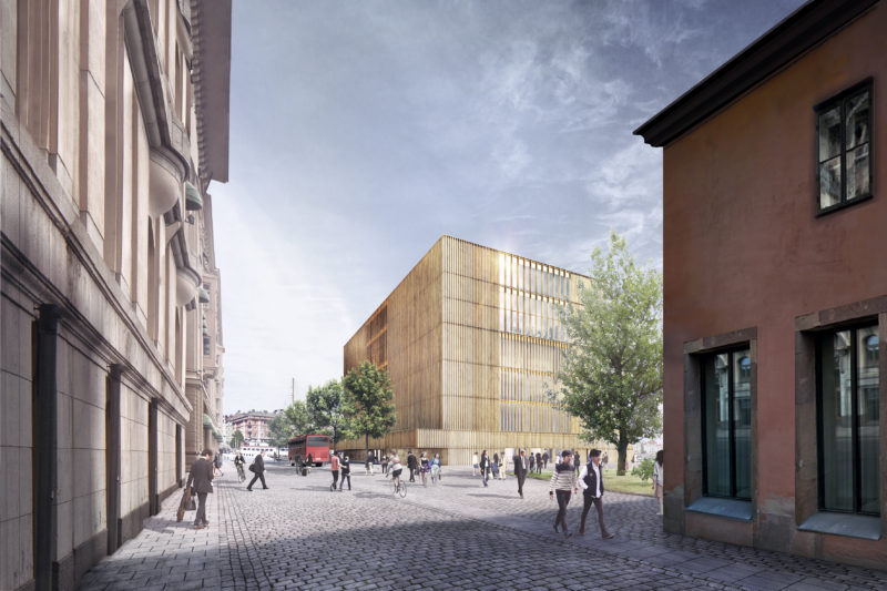
The stair has echoes of the Neues Museum, but it also calls to mind a Venetian palazzo, with tantalising glimpses of water beyond. Set on the city’s main harbour front, on axis with the Royal Palace across the water in Gamla Stan, the Nationlamusuem establishes a civic and architectural dialogue with its regal neighbour, crystallising the historic reciprocity between high culture and the Swedish aristocracy. Founded in 1792 as the Royal Museum, its benefactors included King Gustav III and Carl Gustaf Tessin, whose 2000 drawings acquired during his tour of duty as Sweden’s ambassador to France form a key cornerstone of the collection. Spanning from the Middle Ages to the present day, this trove of accumulated riches also encompasses paintings, sculpture, prints and applied arts. Yet only a small fraction can be exhibited at any one time.
When Wingårdh and his collaborator, specialist conservation architect Erik Wikerstål, came to approach the latest remodelling, it was clear that the museum required a radical overhaul. Over time, a series of piecemeal hacks and reorganisations had conspired to compromise the quality of the internal spaces and visitor experience. Windows were blocked up restricting daylight, environmental control was outdated, exhibition spaces felt tired and circulation had become sclerotic and inefficient. It was a familiar dilemma for a major museum of its vintage. Therefore the aim of the 1 000 million SEK project was to gently coax it back to life, refreshing both the building and the way its collections were presented to the public, without compromising Stüler’s original architecture.
Aptly, perhaps, the most conspicuous contemporary intervention is concerned with improving circulation. A new lift block set in the south courtyard enables visitors, and crucially, works of art to be easily conveyed around the building, so gallery spaces can be used more intensively. Prior to this, large areas had to be closed off when exhibitions were changing. Wrapped in a ‘woven’ skin of patinated brass strips, the gleaming monolith of the lift shaft has a dual function. A hand-cranked mechanism enables the metal carapace to slide open so the lift’s rear wall can serve as an impromptu screen for talks and events in the courtyard. It’s a cunning and inventive use of space that opens up new possibilities for the building as a flexible armature for different kinds of activities.
The architects brooded over the surface of the lift enclosure. They considered a glass showcase of objects from the museum’s collection, a concrete casting or a wickerwork of patinated brass, which was eventually adopted. Devised through experimenting with different prototypes, the woven metal skin has echoes of Gottfried Semper and his theories concerning the primeval origins of architecture. Semper was a contemporary of Stüler, working with him on the Schwerin Palace in northern Germany, known as the ‘Neuschwanstein of the North’. Compared to the sober Italianate architecture of the Nationalmuseum, Schwerin’s more Romanticist flourishes show Stüler to be an architect of considerable range. The woven motif is echoed in the concrete walls of a new loading bay at the rear of the building, subtly emphasising its role in the smooth running of the refurbished museum.
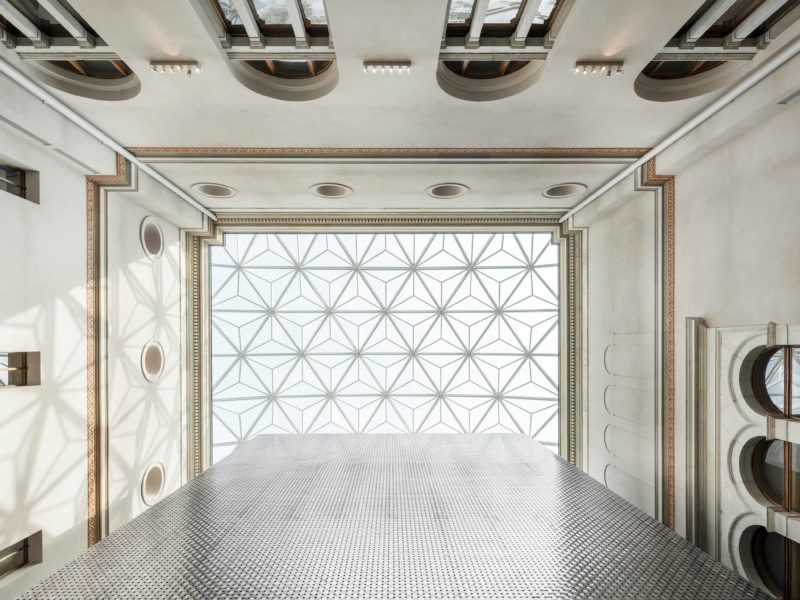
Both courtyards have new glass roofs, the project’s other obviously modern element. Externally, these register as discreet flat domes, but internally, a domed form does not work, setting off distracting reverberations and echoes.
The architects wanted to find a different solution than the one in the British Museum’s atrium, which can be perceived as very noisy. Instead of employing flat panes, each glazed panel resembles a miniature pyramid. This more complex form breaks up reflected sound, directing it into walls lined with absorbent plaster. It’s another example of elegant problem solving to produce a crystalline glass enclosure that has a distinctive rigour and richness. ‘To the untrained eye, it’s almost nineteenth century in its expression’, comments Wingårdh.
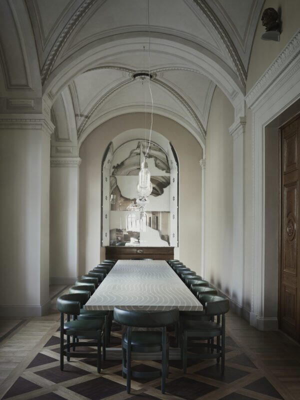
Gallery spaces, which range from the smaller ‘cabinet rooms’ to soaring, double height volumes, have undergone crucial yet almost imperceptible modifications, such as improved lighting and air handling, with service runs threaded through the labyrinthine structure to connect with new plant rooms in the basement. To accommodate the plant machinery, the existing basement level was excavated, creating more space, which also had the effect of bringing the building’s vaulted undercroft into play as a capacious new cloak room. Such back-of-house activities underscore the ambition to effectively double visitor capacity, from 1000 to 2000 people at any one time in the museum.
Certain functions are reallocated to make spaces more adaptable and public facing. In this game of musical chairs, the northern courtyard is now a sculpture gallery, ousting the museum’s cafe, now accommodated in an expanded form at the front of the building. The cafe has in turn ousted the museum’s conservation department, which has been moved off site. To the conservators this might seem like a loss, but their occupation of prime space on the main street frontage is emblematic of how the museum’s organisation had become hermetic and inward looking. Wingårdh and Wikerstål cites the example of the decade-long remodelling of Amsterdam’s Rijksmuseum by the Spanish practice Cruz and Ortiz as a comparable project in terms of its creative unblocking of a large museum that had remained complacently unchanged for many years.
Together, Wingårdh and Wikerstål, characterise their work at the Nationalmuseum as ‘Like letting in a breath of fresh air. A dark museum has become a light museum’. In doing so there is both boldness and delicacy, expressed through strategic moves and thoughtful details, all calculated to allow the building to speak for itself with greater clarity and poise. Apart from the wickerwork lift monolith, there is no obvious ‘cut’ between old and new, resulting in a kind of stealthy, silent architecture. Nonetheless, it has a powerful eloquence.
